Over the past two blog posts about crisis coping, we’ve listened in on a conversation between the author, Ellyn Kail, and photographer Danny Ghitis about various methods to cope for creatives who have been entangled in the Coronavirus pandemic.
In this, the third and last post of the series, they explore what it’s like finding a sense of community during these very scary times.
*********************************
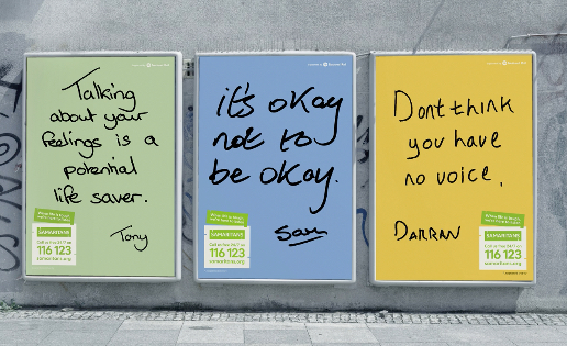
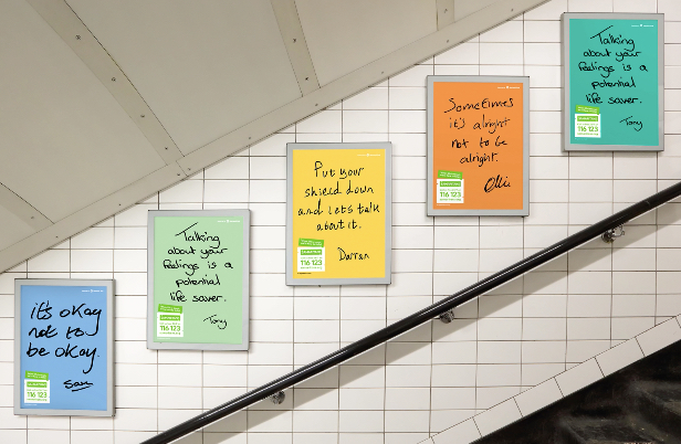
In the last two weeks, I have received more than two dozen emails about the temporary closures of galleries and studio spaces amid the coronavirus pandemic. I’ve received several more about canceled exhibitions. This is a period of uncertainty for the photography community as a whole, but in this time, we’ve also witnessed people coming together.
In between those letters about closures and cancelations, there have also been emails from artists who are hosting camera giveaways, publishers who are discounting their books, and non-profit organizations who are offering free talks and photog resources.
Globally, photographers are sharing information about how we can donate supplies to local hospitals and encouraging us all to practice social distancing for the safety and well-being of the community.
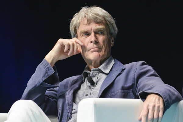
Over the past week, we’ve spoken to the photographer and professional development coach Danny Ghitis about how creatives can cope during this time and continue to create meaningful work in unprecedented circumstances.
Photography, like any art form, can be a solitary pursuit, but it’s also full of communities and resources. With all the recent gallery closures and exhibition cancellations, how can photographers stay connected and engaged with one another?
“This is so crucial. One of the main causes of my own burnout was a feeling of isolation as a photographer, and that was way before all this coronavirus mayhem. We are wired to need other people. That lone wolf photographer icon can be really damaging because it makes asking for help look like a weakness when, in reality, it’s a superpower.
“In a way, this moment offers a unique opportunity. Everyone is struggling with the same overarching challenge. Everyone needs help, and we have the technology to easily stay in touch. We’re not as spread thin as usual with a thousand networking events, galleries, meetings, etc. So reach out, offer support, provide feedback, invite conversation, have a virtual coffee, host a roundtable discussion.”
Has the creative community faced any upheavals like this one in recent years, if not on the same scale? If so, what can we learn from that time, and how can we apply those lessons to the here and now?
“I graduated from college with a photojournalism degree in 2006, the year before the iPhone hit the market and changed everything. The newspaper bureau where I interned closed a couple months after I arrived (not my fault, I swear!). I started my freelance career at the same time as the 2008 financial meltdown.
“Somehow, I made it work and grew as a human and professional. And guess what, I’m not that special. Human beings are resilient by evolutionary design. We’ve outlasted and overpowered nearly every other living organism and are capable of incredible adaptation. If you’re reading this and you’re human, you already have the tools you need inside your body.”
What are some ways you see the creative community coming together right now to support and help one another? Any moments that have given you hope?
“All of a sudden we’re in it together. We have a common struggle and purpose. We’re thinking collectively like a tribe like in the good old prehistoric days. Of course, we don’t wish sickness and suffering upon anyone and hope this goes away soon, but it does offer a unique opportunity to see the big picture.
“I keep getting emails and social media posts about virtual gatherings and support groups, and I am getting more messages than usual from friends checking in. I just started an online meetup group, and there are lots of others out there if you’re willing to search. It’s all about taking initiative and reaching out.”
How would you advise photographers and other creatives who suddenly have a lot of free time on their hands?
“This can be viewed as a great opportunity because we’re being forced to evaluate how to spend our time wisely. First, the mindset work. If you’re not in a good state of mind, it’s very hard to be focused and productive. If you want business results, practice self-care. Remember how flight attendants demonstrate putting on your oxygen mask first? Same deal. Take care of yourself to take care of others.
“Ask yourself, ‘How can I serve?’ It’s easy to get caught up in self-centered problem solving during a crisis, while orienting toward service can be more effective in creating action and will make you feel better. What do others need, and what skills do you have that can help them?”
**********
We are truly living in unprecedented times. Deadly times. History has recorded plagues, wars, and various catastrophes yet we’ve managed to survive. Granted, the planet has lost life in measurable means before but we’ve never faced a global pandemic like this before. I guess, in a sense, this could be compared to chemical warfare on a global scale from an invisible enemy.
Yet, we will live on. We will create and innovate. We have to do that now to find a vaccine to nullify the virus so we may begin to get used to a new normal. Things won’t be the same since we won’t be the same, those of us who will survive. But we will. We have to. Together. Smarter. Stronger. More persistent. Less partisan.
Wait, what’s that? It’s creativity knocking at the door. Let’s welcome her in, shall we!
This is part three of three of our interview with Danny Ghitis. Here are parts one and two.


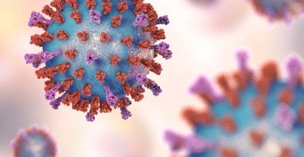
 In some strange way there is beauty among these images. Strange and weird and deadly. Awesome.