Winning an award in the advertising business is a big deal. The really big deals come annually during the sun-baked, beach-worshipping, booze-enhanced party in France known famously as the Cannes International Festival of Creativity. This year was no exception.
Except. One campaign that did win a Lion was done by MullenLowe/SSP3 for Hyundai called Speeding Emojis. As their brief explained, “Every day, more people are involved in car accidents for texting and driving. To make drivers aware of this issue, we decided to use one of the most common elements, when it comes to writing: emojis. But we wanted to use them in a different way. So, we decided to show how they would look at 69, 85, 43 and 76 km/h to prove that texting and driving at the same time just doesn’t make sense.”
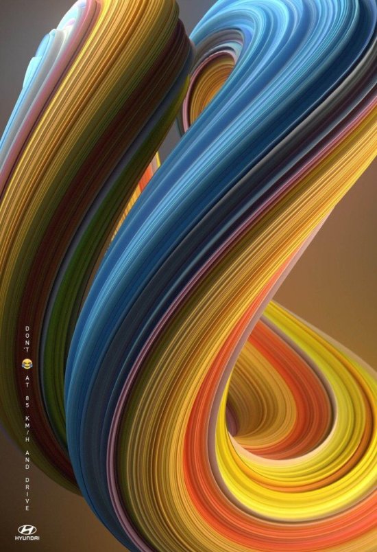
Colorful representation of an emoji used while texting when traveling at various high speeds. Note the vertical line of copy at left basically saying “don’t text at xy speed and drive.”
The explanation given in the brief by the agency obviously doesn’t appear in the ad, nor should it. Given this, how is one to know what the image is? While the single line of copy is pretty self-explanatory, the big-ass image of a color swirl is not.
The campaign also uses several different emoji varieties with accompanying swirls of different colors, tying in with that emoji.

Another in series of colorful swirls in Hyundai’s Don’t (emoji) and Drive campaign
Given that the image dominates the ad and the tag line is sort of lost, it sort of begs the question: What the Hell does the image represent and/or why isn’t that explained in some fashion? Given an art director’s or designer’s perspective, one might wonder, “How’d they do that?” or “What is that supposed to be?”
Well, this is where it gets even more interesting. According to a post on Twitter, a very “similar looking” image is available from Shutterstock. Now, it’s not unusual to use stock imagery in spec work or presentations but unless an agency is in partnership with a stock footage and imagery company like Shutterstock, this is highly unusual and probably not even kosher. There’s not even a credit given to Shutterstock in the ad nor to the designer who created the original artwork, Rik Oostenbroek.

Color swirl image via Shutterstock compared to image used in Hyundai ad campaign.
I’m surprised that, to my knowledge thus far, neither Shutterstock nor Rik Oostenbroek have contacted the agency or Hyundai about about this; of course, this assumes that approval was given beforehand. Even if it was, where’s the credit?
In reporting on the story, Adweek requested a response from MullenLowe who sent the following:
“In regards to this particular campaign, the images were identified as the most fitting way to illustrate the important ‘don’t text and drive’ message for our client. The appropriate rights for the four images were purchased through the correct channels and we acted legally within the terms of the licence. We have been in contact with the artist claiming credit for the work on social media, with a full explanation of the creative process and the surrounding legalities.
“D&AD investigated the entry and deemed it eligible on the evidence provided.”
But . . . where’s the originality? Some folks may not have a problem with using stock imagery in ads while I’m sure some do. Are we seeing some sort of trend in advertising? What’s the proper use of stock photography and when and where should it be used?
“If you literally copy and paste something and stick a line of copy on it, I don’t think it’s worthy of an award,” said Chris Garbutt, global CCO of TBWA\Worldwide and a frequent awards juror. “I don’t think it’s enough to do that anymore.”
I believe this ad and its campaign has a few issues. Feel free to write in the comments section of this blog and let me know your thoughts.
Personally, these images remind me of something caught in a time warp, but absolutely nothing concerning automobiles. The concept of “don’t text and drive” could apply to any cell phone provider’s message, for that matter.
The images do illicit one’s attention. However, their reaction may produce a “WTF?”
Go figure.
